Overview:
Quibble is an automated platform designed to enhance communication between software users and developers by streamlining the feedback process. The platform captures user feedback—often found in tweets or app store reviews—and automates its prioritization and resolution. This helps developers address consumer concerns more efficiently and effectively, closing the feedback loop that often remains broken in software development.
Objective:
My primary responsibility was to create a visual identity, including the logo design, and to develop a process wireframe that would present Quibble's concept to potential investors in a clear and compelling way. The visual identity needed to be modern and playful, resonating with both developers and users, while the process wireframe had to effectively communicate Quibble's unique value proposition.
Logo Creation:
The logo design process began with research and brainstorming to understand the core values and mission of Quibble. The goal was to create a logo that was not only visually appealing but also reflective of the platform’s innovative and user-friendly nature.
Concept Development:
Research: I analyzed competitors, identified industry trends, and explored various design inspirations to gather insights.
Sketching: I sketched out multiple concepts, focusing on simplicity, modernity, and playfulness. The sketches explored different symbols and typography that could represent the idea of communication and feedback loops.
Design Execution:
Digital Rendering: The selected sketches were digitized using design software, where I experimented with various color schemes, typography styles, and layouts. I aimed to achieve a balance between professionalism and creativity, ensuring that the logo would be versatile and memorable.
Refinement: I refined the digital drafts, fine-tuning the details such as line weights, spacing, and color combinations. Feedback from team members was incorporated to ensure the logo resonated with the intended audience.
Finalization:
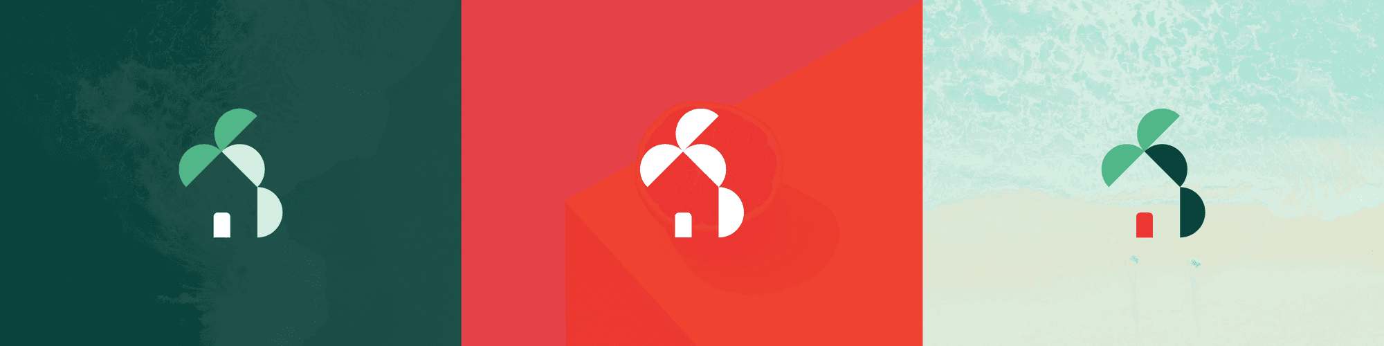
The final logo design was a modern, playful emblem that encapsulated the essence of Quibble’s mission. The design was versatile enough to be used across various platforms and media, ensuring consistency in Quibble’s brand identity.
Version 1

Final Version

Process Wireframe Development:
The process wireframe was created to visually map out how Quibble would function, from capturing user feedback to resolving issues. The wireframe needed to be intuitive and straightforward, making it easy for developers to navigate and utilize the platform effectively.
User Journey Mapping: I created a visual representation of the feedback loop, highlighting each step from the moment a user submits feedback to the resolution of the issue.
Interactive Elements: The wireframe included interactive elements to showcase how users and developers would interact with the platform, emphasizing the ease of use and the automation of feedback prioritization.


Outcome:
The visual identity, including the logo design and process wireframe, was instrumental in Quibble earning 2nd place at TechStars' Startup Weekend. The strong visual aids provided investors with a clear and engaging understanding of Quibble’s value proposition, contributing to the project's overall success.
This case study highlights my ability to create cohesive brand identities and user-centered designs that align with business goals, demonstrating the importance of effective visual communication in early-stage startup environments.